
 MindPlot
Your Own AI Co-Scientist
From data cleaning, modeling and statistical analysis to publication-ready plots and professional reports —your one-stop AI data toolkit.

MindPlot Offer
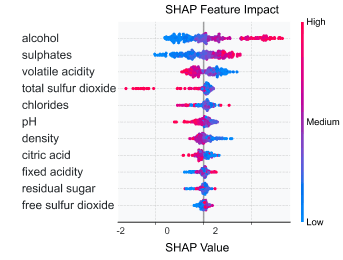
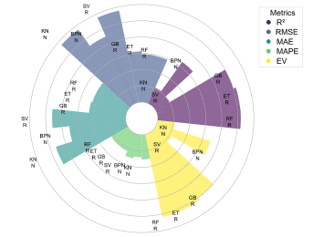
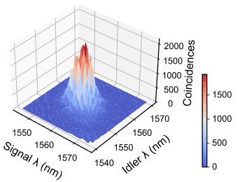
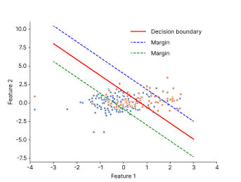
Beautiful, publication-ready scientific plots
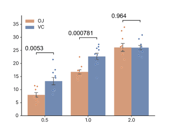
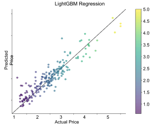
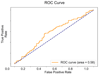
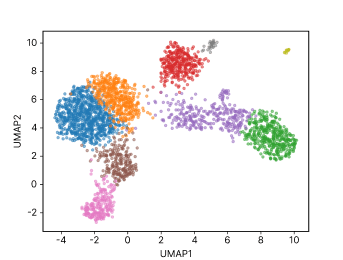
MindPlot Features
Talk to your data
Conversational AI for natural commands. No coding needed.
Auto data cleaning
Fix missing values, outliers instantly
Tweak on-the-fly
Change fonts, colors, scales instantly
AI Power
More Intelligent. AI understands you.
Feed Anything
Images, Excel, CSV
Flexible Export
Bitmap (png,jpg), vector(svg,pdf)
Full Statistical Reports
Auto-generated Word/PDF with methods & results
Code Export
Download Python code to verify analyses
MindPlot research blog
Ideas, methods, and evidence.
How to Analyze Time Series with Aeon: DTW Classification, Clustering, and Similarity
Aeon provides a consistent Python toolkit for comparing, classifying, and clustering ordered signals without flattening away their temporal structure. In the worked example below, a DTW nearest-neighbor model identifies the direction of two unseen curves, time-series k-means recovers the two underly
Read article →02How to Analyze Partitioned Scientific Data with Dask DataFrame, Array, Delayed, and Distributed
A reproducible Dask workflow can read partitioned measurements lazily, filter and aggregate them, write a partitioned Parquet dataset, transform a chunked numerical array, and evaluate an explicit task graph without forcing all intermediate data into memory. In the validated example, three CSV parti
Read article →03How to Detect Scientific Computing Resources with Python, psutil, and a Reproducible System Inventory
A reliable scientific computation begins by measuring the machine that will run it. In the validated example documented here, a native resource detector identified 8 physical CPU cores, 16 logical CPU cores, 31.06 GiB of RAM, 16.06 GiB of currently available RAM, 103.12 GiB of available project-di
Read article →04How to Find Biology Machine-Learning Models with a Reproducible Hugging Face Catalog Search
Direct answer: The validated live catalog query found 95 biology-related model records. It produced a 41,912-byte JSON snapshot and a 2,587-byte Markdown recommendation report; it did not download, benchmark, or endorse any model.
Read article →05How to Solve and Audit a MATLAB-Compatible Linear Algebra Workflow with GNU Octave
GNU Octave solved the system as x = [2, 3] and independently verified that expected vector. Five signal observations had mean 6 and sample standard deviation 6.59545297913646. The workflow retained a MATLAB-compatible MAT workspace and both raster and vector plots. This result passed native executio
Read article →06How to Create Publication-Ready Multi-Panel Scientific Figures with Matplotlib
The workflow read six measurements and created two object-oriented Matplotlib axes with line, error-bar, scatter, annotation, and legend artists. It exported a 1823 by 1223 pixel PNG at 200 dpi and an SVG configured to retain editable text. This result passed native execution, real chat-driven execu
Read article →07How to Differentiate a Quantum Circuit with PennyLane Automatic Gradients
At θ = 0.432 radians, the Pauli-Z expectation on wire 1 was 0.908130190694961. PennyLane returned a gradient of −0.4186878989752795; the analytic value −sin(θ) was −0.41868789897527947, giving an absolute error of 5.55 × 10⁻17. This result passed native execution, real chat-driven execution, and sem
Read article →08How to Build, Transpile, and Validate a Bell-State Experiment with Qiskit
Scientific introduction A Bell-state experiment is one of the smallest workflows that demonstrates a genuinely quantum relationship between two qubits. The circuit begins in the computational basis state |00〉, applies a Hadamard gate to the first qubit, and then applies a controlled-X gate from the
Read article →09How to Simulate a Damped Harmonic Oscillator and Validate Photon Decay with QuTiP
Scientific introduction Open quantum systems exchange energy or information with an environment, so their evolution cannot generally be represented by a closed-system Schrödinger equation alone. A widely used Markovian description is the Lindblad master equation, which evolves a density operator und
Read article →10How to Calculate Electronic Reaction Energy with Psi4 and Compare Basis Sets
Scientific introduction Reaction energies connect molecular electronic structure with chemical change. At the simplest quantum-chemical level, an electronic reaction energy is the stoichiometric difference between product and reactant electronic energies. Although the arithmetic is short, a defensib
Read article →11How to Calculate Vertical Ionization Potentials and Electron Affinities with GFN2-xTB
Scientific introduction Oxidation and reduction involve removing or adding electrons, but a computed “redox value” is meaningful only when its state definition and thermodynamic scope are explicit. Ionization potential measures the energy cost of electron removal; electron affinity describes the ene
Read article →12How to Develop an Evidence-Audited NSF Research Grant Planning Package
The run produced seven planning deliverables. The audit confirmed the three-year duration, total direct cost, and objective count against the input. It marked submissionready as false and returned passwithflags for unsupported-claim scanning, preserving issues that require investigator and instit
Read article →13How to Develop Falsifiable Microplastics and Drought Hypotheses for Wheat
The validated dossier preserved the 12-week duration, four growth chambers, and USD 12,000 ceiling; generated seven mechanistically distinct, explicitly exploratory hypotheses; included four cross-disciplinary connections and six challenged assumptions; and prioritized three ideas under a chamber-aw
Read article →14How to Critically Appraise a Prevention Trial with Attrition and Outcome Switching
Among analyzed participants, infection risk was 12/42 = 28.57% with Supplement X and 18/56 = 32.14% with control, an absolute risk difference of −3.57 percentage points. Because attrition was differential, concealment unclear, participants and assessors unblinded, and the registered primary outcome
Read article →15How to Create a Publication-Ready Dose–Response Figure with Matplotlib and Seaborn
A validated two-panel dose–response workflow produced a 300-DPI PNG and an editable SVG from four dose levels. At 4 µM, the control endpoint was 90% and the treated endpoint was 43%, an observed separation of 47 percentage points. The final figure used Matplotlib 3.10.5, Seaborn 0.13.2, an expli
Read article →16How to Explain Random Forest Predictions with SHAP, TreeExplainer, Beeswarm, Dependence, and Waterfall Plots
Scientific introduction Predictive models can achieve useful accuracy while remaining difficult to inspect. A random forest, for example, combines many decision trees whose splits and interactions cannot be summarized faithfully by reading one tree. Model explanation methods address a narrower quest
Read article →17How to Simulate a Single-Server Queue with SimPy: Discrete-Event Simulation Tutorial
Four customers arriving at times 0, 1, 2, and 3 to one server, with deterministic two-time-unit service, produce waits of 0, 1, 2, and 3 time units. A real SimPy 4.1.1 execution therefore measured a mean wait of 1.5, a maximum wait of 3, and final completion at simulation time 8. These v
Read article →18How to Calculate Electronic Excitations and a UV–Visible Stick Spectrum with Psi4 TD-SCF
Scientific introduction Electronic absorption spectroscopy probes transitions between molecular electronic states. Linear-response time-dependent methods estimate vertical excitation energies and transition strengths at a fixed nuclear geometry. Converting energy to wavelength is convenient for visu
Read article →19How to Run Thompson Sampling over a Combinatorial Molecular Library
Scientific introduction Thompson sampling is a probability-matching strategy for sequential decisions under uncertainty. A posterior distribution is maintained for each action or component; one plausible value is sampled from each posterior, and the action favored by that sampled world is evaluated.
Read article →20How to Train and Validate a Graph Convolutional Network with PyTorch Geometric
Scientific introduction Graph neural networks learn representations by combining node attributes with information propagated along edges. A graph convolutional network repeatedly aggregates neighbor features, applies trainable transformations, and produces embeddings that can support node, edge, or
Read article →Frequently Asked Questions
What is MindPlot and how does it work?
MindPlot transforms complex datasets into publication-ready plots without coding. Upload your data, describe what you want, and get professional visualizations in one click.
Do I need programming skills to use MindPlot?
No coding required! Our conversational interface lets you create sophisticated visualizations using natural language, perfect for any skill level.
What makes MindPlot different and can I customize plots?
Our unique multi-agent system enables real-time plot customization without slow reprocessing. Adjust styles, colors, and layouts instantly through our conversational interface.
What chart and plot types can MindPlot make?
MindPlot generates publication-ready scientific charts of every kind — Kaplan-Meier survival curves, meta-analysis forest plots, volcano plots, correlation-matrix heatmaps, ROC curves, box, violin and beeswarm plots, regression, scatter and PCA plots, and more. Just upload a CSV and describe what you need.
Is my data secure? Do you use it to train models?
Your data privacy is our priority. We do NOT use your data to train our models. All processing is secure and confidential.
MindPlot® AI Scientific Data Toolkit
MindPlot® is an AI co-scientist for the entire research workflow — read, analyze, write, visualize, and present. Our unified suite (MindReader, MindChat, MindSheet, MindWriter, MindPlot, MindChart, MindDraw, MindFlow, MindVector, MindSlide, MindNote) helps researchers go from papers and raw data to publication-quality results in one place.
The Complete AI Research Suite
- MindReader: AI paper reader and literature summarizer — upload PDFs to summarize methods, extract findings, and translate.
- MindChat: One AI chat for ChatGPT, Claude, Gemini, and DeepSeek — switch models mid-conversation, pay per token.
- MindSheet: AI spreadsheet to clean, transform, and analyze research data with natural language — no formulas required.
- MindWriter: AI academic writing assistant for drafting papers, grants, and latex manuscripts.
- MindPlot: Publication-quality scientific static plots (Matplotlib/Seaborn) with APA/Nature styling — Kaplan-Meier survival curves, forest plots, volcano plots, heatmaps, box & violin plots, and more.
- MindChart: Interactive data exploration charts (ECharts) for presentations and web sharing — correlation matrix heatmaps, ROC curves, regression and time-series plots.
- MindDraw: Scientific illustration generator for graphical abstracts and mechanism diagrams.
- MindFlow: AI diagramming tool for research workflows, process maps, and experiment logic.
- MindVector: AI vector graphics editor for figures, scientific diagrams, and editable SVG artwork.
- MindSlide: AI presentation maker for academic talks, lab meetings, and thesis defense slides.
- MindNote: AI knowledge hub that captures and links your papers, chats, and figures into a searchable second brain.
Key Capability: Publication-Ready Scientific Visualization
- Automated statistical analysis (t-test, ANOVA) integrated with visualization
- High-DPI exports (300dpi+) for journal submission (PDF, SVG, PNG, EPS)
- Strict adherence to academic styling guidelines (APA, Nature, Science)
Scientific Chart & Plot Types We Generate
Describe your data and MindPlot's AI builds the exact chart you need: Kaplan-Meier survival curves and survival-plot generators, meta-analysis forest plots, volcano plots for differential expression, correlation-matrix heatmaps, ROC curves, box, violin, beeswarm and density plots, regression and scatter plots, PCA plots, dendrograms, and confusion matrices — all publication-ready, no coding.
- Kaplan-Meier survival curve generator (survival analysis, log-rank)
- Forest plot maker for meta-analysis and effect sizes
- Volcano plot generator for RNA-seq and proteomics
- Heatmap and correlation-matrix generator (CSV to heatmap)
- Box, violin, and beeswarm plots with built-in statistical tests
- ROC curves, regression plots, and confusion matrices
- CSV to chart in one click — upload data, get a figure
Trusted by Scientists Worldwide
- Academic research and scientific publications
- Biomedical and pharmaceutical research
- Environmental science and climate research
- Social sciences and psychology
- Engineering and technical analysis
- Business intelligence and market research
- Quality control and manufacturing
- Financial analysis and reporting
About Cosinx AI
Developed by Cosinx AI, a leading artificial intelligence company specializing in scientific visualization and drug discovery. Our mission is to democratize data science and make advanced analytics accessible to researchers and professionals across all disciplines.


