
Table of contents
- Scientific introduction
- Why scientific visualization is part of the analysis
- Dose–response plots and the meaning of an endpoint difference
- Error bars are claims, not ornaments
- Typography, hierarchy, and the font repair
- Color accessibility and redundant encoding
- Raster and vector deliverables serve different purposes
- Semantic validation beyond file existence
- Test progress
- Demo user request
- Demo data
- Validated workflow
- Results and artifacts
- What failed and how the plotting contract was repaired
- How to review a production figure
- Reproducibility
- Limitations
- References
- Try this workflow
A validated two-panel dose–response workflow produced a 300-DPI PNG and an editable SVG from four dose levels. At 4 µM, the control endpoint was 90% and the treated endpoint was 43%, an observed separation of 47 percentage points. The final figure used Matplotlib 3.10.5, Seaborn 0.13.2, an explicit DejaVu Sans font stack, a color-vision-aware blue/orange palette, error bars, direct panel labels, and a frameless legend. Retained attempt 8 passed package installation, native plotting, natural-language chat execution, and semantic artifact validation on Linux x86_64 CPU. The result demonstrates a reproducible visualization workflow; it does not establish treatment efficacy or statistical significance.
Scientific introduction
Why scientific visualization is part of the analysis
A scientific plot is not decoration applied after an analysis. It is a compact model of the data, the comparison being made, and the uncertainty that the author believes a reader should consider. Choices about axes, aggregation, error bars, color, typography, and panel composition determine which patterns become visible and which caveats remain easy to miss. A graph can contain numerically correct points yet still mislead through a truncated scale, an ambiguous denominator, an inaccessible palette, or a caption that overstates what the observations support. Publication-ready visualization therefore combines computation, graphic design, statistical restraint, and explicit provenance.
The foundational “grammar of graphics” view treats a plot as a mapping between variables and visual properties rather than as an arbitrary drawing. Data fields are assigned to position, color, shape, or size; statistical transformations may summarize raw observations; scales translate values into perceivable dimensions; and coordinate systems establish spatial meaning. Matplotlib provides low-level control over these elements, while Seaborn offers statistical defaults and convenient semantic mappings. Neither package can decide whether the scientific question is appropriate. The investigator still has to specify what each row represents, which comparison matters, and what uncertainty can legitimately be displayed.
The demonstration in this dossier is intentionally small: two series are observed across doses of 0, 1, 2, and 4 µM. The control means are 100%, 96%, 93%, and 90%; the treated means are 100%, 82%, 65%, and 43%. Standard deviations of 3, 4, 5, and 5 percentage points are supplied for the treated series. This structure supports a compact teaching example because the underlying values can be audited without a database or a specialized instrument file. It does not support population inference because replicate-level observations, control variability, sampling design, and inferential assumptions are not provided.
Dose–response plots and the meaning of an endpoint difference
A dose–response experiment relates an applied dose or concentration to a measured biological, chemical, or physical response. Depending on the field, investigators may use such data to estimate potency, efficacy, toxicity, inhibition, activation, or a calibration relationship. A common parametric analysis fits a sigmoid such as the four-parameter logistic model, with lower and upper asymptotes, a midpoint such as EC50 or IC50, and a slope parameter. That model is inappropriate here because four summarized observations without replicate-level uncertainty do not justify a fitted potency estimate. The validated workflow instead displays the observed series and reports the directly auditable endpoint contrast.
At the highest supplied dose, 4 µM, the arithmetic difference is 90% − 43% = 47 percentage points. “Percentage points” is the correct unit for an absolute difference between two percentages. Calling the result a “47% reduction” would imply a relative calculation and would be numerically different: relative to the 90% control value, the observed decrease is about 52.2%. The article therefore retains the absolute 47-percentage-point statement and avoids converting it into an efficacy claim. No p-value, confidence interval, model fit, or causal conclusion was calculated.
The x-axis also deserves care. Dose values often span orders of magnitude and may benefit from logarithmic scaling, but zero cannot be shown on an ordinary logarithmic axis. This demo uses a linear dose axis so the untreated zero-dose observation remains visible and the spacing reflects the supplied values. For a production assay spanning nanomolar to micromolar concentrations, a logarithmic axis or a carefully documented transformed scale would often be more useful. The decision should follow the scientific range and intended comparison, not a habitual plotting template.
Error bars are claims, not ornaments
An error bar must name the quantity it represents. Standard deviation describes dispersion among observations, standard error describes uncertainty in an estimated mean under assumptions, and a confidence interval communicates an interval procedure with a stated coverage level. These quantities are not interchangeable. The demo labels the supplied treated uncertainty as standard deviation because that is what the fixture declares. It does not synthesize control error bars or pretend that the supplied summary includes replicate counts.
Readers should be especially cautious when a line connects summarized means. The connecting segment guides the eye through ordered doses, but it does not prove that intermediate responses follow a linear path. Likewise, overlapping or non-overlapping standard-deviation bars are not a hypothesis test. A rigorous production workflow should preserve the replicate-level data, show individual observations where practical, predefine exclusion rules, and use an analysis suited to the experimental design. The plot can then complement rather than substitute for the statistical model.
Typography, hierarchy, and the font repair
Typography affects both legibility and reproducibility. A plotting script that merely requests a generic family such as sans-serif may resolve to different fonts on different operating systems. A missing font can produce warnings, altered text metrics, clipped labels, or inconsistent appearance between PNG and SVG output. Earlier attempts in this test sequence exposed that risk: the requested presentation was not sufficiently pinned, so the plotting instructions and implementation were repaired to require an installed font explicitly. Attempt 8 records DejaVu Sans as both the active family and the first sans-serif choice.
DejaVu Sans is bundled with common Matplotlib installations and provides broad character coverage. Explicit selection does not make it universally ideal, but it makes this retained Linux result reproducible. A journal may mandate Arial, Helvetica, Times, or another typeface; in that case, the production environment should install the exact licensed font, verify its resolved file, and inspect the exported vector text. The essential lesson is to validate the font actually used rather than trusting a configuration string.
Visual hierarchy helps a reader understand a multi-panel figure without hunting. Panel labels “A” and “B” identify the endpoint comparison and dose–response views. Axis labels state the dose unit and response scale. A frameless legend reduces unnecessary enclosure while retaining the series mapping. The 300-DPI raster export supports common review and presentation uses, whereas the SVG preserves editable vector geometry for layout and publication systems that accept it.
Color accessibility and redundant encoding
The final palette uses blue #0072B2 for control and orange-red #D55E00 for treated observations. These colors are associated with a widely used color-vision-aware palette and offer useful luminance and hue contrast. Color selection alone is not a complete accessibility strategy. Line style, marker shape, direct labels, panel structure, and adequate contrast should provide redundant cues when a figure will be printed in grayscale or viewed by readers with color-vision deficiencies.
The workflow avoids a rainbow scale because the variable being encoded is categorical, not a continuous magnitude requiring many hues. It also avoids red-versus-green as the only distinction. In a more complex experiment, the author should test the rendered image with an accessibility simulator and inspect it at its intended physical size. A palette that looks distinct on a large monitor can collapse when reduced to a narrow journal column.
Raster and vector deliverables serve different purposes
PNG is a lossless raster format. It is convenient for web pages, slide decks, electronic lab notebooks, and review systems that expect fixed pixels. Resolution is determined by pixel dimensions and intended display or print size; a “300 DPI” setting is meaningful only in relation to those dimensions. Enlarging a small raster later cannot recover missing detail.
SVG is a vector format that stores paths, shapes, and often text. It can be resized without pixelation and edited in vector-aware software, which makes it valuable for final figure assembly. SVG can nevertheless vary between renderers, and embedded fonts or text substitutions can change appearance. A robust workflow checks both exports, keeps the source data and script, and avoids treating the editable vector file as an invitation to alter scientific values manually.
Semantic validation beyond file existence
A successful plotting command is not enough. A blank white PNG, an SVG containing no plotted marks, or a chart generated from stale input can all coexist with a zero exit code. The semantic validator for attempt 8 checks the declared package versions, panel descriptions, output formats, 300-DPI target, font configuration, palette, and the 47-percentage-point endpoint difference. It also requires the CSV, PNG, SVG, and JSON summary to exist and be non-empty.
This layered validation separates three propositions. First, the plotting packages installed and ran. Second, a natural-language request activated the intended workflow and created the named deliverables. Third, the retained deliverables describe the expected data and visual design. The screenshot demonstrates how a result report is presented in the real chat application, while the artifact previews and checksums connect that presentation to retained evidence. No single screenshot is treated as proof that the underlying calculation occurred.
Test progress
| Gate | Retained status | Evidence from attempt 8 |
|---|---|---|
| Skill installation | Passed | Packaged instructions loaded into the isolated agent context |
| Package installation | Passed | Matplotlib 3.10.5 and Seaborn 0.13.2 in the retained environment |
| Demo data | Ready | Four-row CSV with dose, control mean, treated mean, and treated SD |
| Native key feature | Passed | Two-panel PNG/SVG plot and JSON summary generated |
| Chat execution | Passed | Natural-language request produced all canonical deliverables |
| Artifact validation | Passed | Values, font, palette, panels, formats, and endpoint contrast checked |
| Publication gate | Passed | Three provenance-manifested PNG images support this article |
Demo user request
Create a publication-quality two-panel dose-response figure from the demo values. Panel A should compare the control and treated endpoints with error bars. Panel B should show the complete dose-response series. Use a colorblind-friendly palette, explicit DejaVu Sans typography, panel labels, a frameless legend, and export both a 300-DPI PNG and an editable SVG. Also save the plotted data as CSV and a JSON summary, and report the endpoint difference in percentage points.
This request states the scientific and presentation requirements in ordinary language. It does not prescribe Python statements or ask the user to manage package APIs. The resulting workflow remains inspectable because the generated script, exact fixture, package versions, and output files are preserved.
Demo data
The demo data are synthetic and repository-owned for workflow validation. They contain summarized values rather than individual biological replicates. Dose is expressed in micromolar (µM), while response and supplied standard deviation are percentage-based quantities. The local provenance note is available in data/README.md, and the exact plotted table is retained as dose-response.csv.
| Dose (µM) | Control mean (%) | Treated mean (%) | Treated SD (percentage points) |
|---|---|---|---|
| 0 | 100 | 100 | 3 |
| 1 | 96 | 82 | 4 |
| 2 | 93 | 65 | 5 |
| 4 | 90 | 43 | 5 |
The table has four observations and four columns. It is sufficient to verify ordering, plotting, endpoint arithmetic, labels, and export behavior. It is not sufficient to estimate an IC50, fit a reliable nonlinear model, infer a population effect, or distinguish technical from biological variation. Those limitations are scientific properties of the fixture, not software defects.
Validated workflow
The workflow began by loading the visualization instructions and creating or verifying the retained Python environment. The package probe recorded versions before scientific execution. The native demonstration then wrote a deterministic CSV, composed two panels, set the font and palette explicitly, and exported PNG and SVG from the same figure object. A JSON summary recorded the design choices and primary endpoint calculation.
The same intent was next submitted through the real chat runtime. The agent inspected the installed instructions, wrote a plotting script, executed it in the managed environment, and created the four canonical outputs under outputs/. A skill-specific validator opened the structured files and checked their meaning. Failed earlier attempts remain retained for diagnosis; the validated article points only to attempt 8.
natural-language objective
  → inspect plotting contract and demo schema
  → verify Matplotlib/Seaborn environment
  → write and execute the figure script
  → export CSV + PNG + SVG + JSON
  → validate values, typography, palette, panels, and formats
  → present a qualified results report
The transparent reproduction commands are:
python test/scientific-skills/run_skill_cycle.py scientific-visualization
python test/scientific-skills/skills/scientific-visualization/chat_e2e.py
python test/scientific-skills/validate_how_to.py \
  test/scientific-skills/skills/scientific-visualization
These commands document the developer validation path. Scientific users do not need to memorize them to formulate the plotting request.
Results and artifacts
The primary result is an observed endpoint separation of 47 percentage points at 4 µM: control 90% versus treated 43%. This value is exact for the supplied integer summaries. No inferential uncertainty was calculated for the difference because the fixture does not include replicate-level control data, sample sizes, or covariance information. The validation status is passed for figure generation and semantic consistency, not for efficacy.
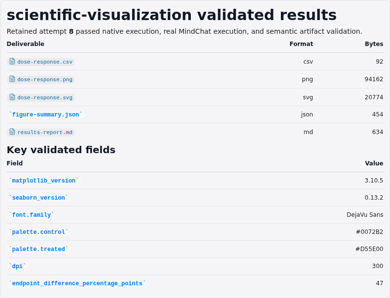
The focused application capture presents the endpoint result, package versions, output formats, and limitation in a results report. It deliberately avoids a file-list view, raw JSON editor, empty canvas, or screenshot of the prompt composer.
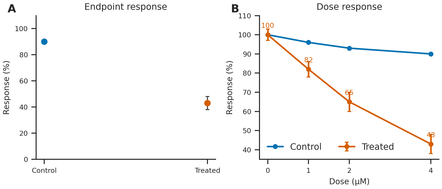
The principal artifact shows the endpoint comparison and the full dose series using the validated font and palette. The high-resolution PNG is the fixed raster deliverable; the matching dose-response.svg is the editable vector deliverable.

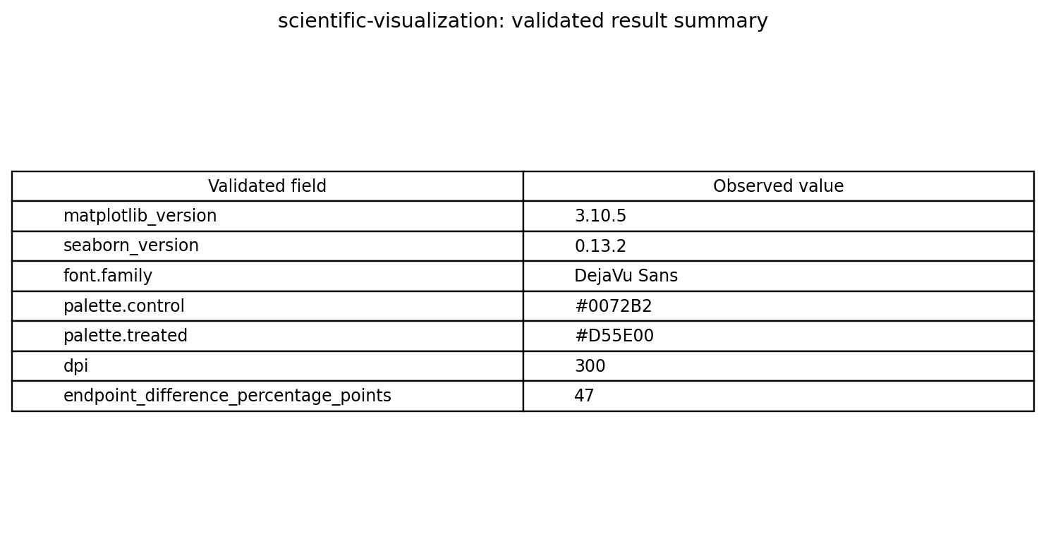
The data-derived visual summarizes retained scalar configuration fields. The authoritative machine record is figure-summary.json, while results-report.md inventories the complete retained output set.
What failed and how the plotting contract was repaired
The successful result followed several failed chat attempts. The important failure was not hidden by rewriting the article. Earlier generated figures did not reliably satisfy the specified typography contract. Generic font selection can appear acceptable on one machine while resolving differently elsewhere, and a language model may omit a subtle style requirement when the instruction treats it as optional polish. The delivered plotting guidance was strengthened so that explicit font configuration became a required step rather than a suggestion.
The repaired workflow selects DejaVu Sans in the figure configuration and records the resolved family in the JSON summary. The semantic validator rejects an output that does not declare the expected family. The prompt also makes the PNG and SVG names, 300-DPI requirement, panel descriptions, palette, and endpoint arithmetic explicit. Attempt 8 then produced artifacts that matched those instructions.
This feedback mechanism is essential for skill testing. A failure found during E2E execution must improve the delivered instructions or accompanying scripts; it cannot remain only in a temporary test log. Conversely, an article must not soften a failed scientific result into a success story. Here publication began only after the same native and chat-driven case passed semantic validation.
How to review a production figure
Before publication, inspect the plot at the physical size at which readers will see it. Confirm that axis labels and units remain legible, line weights survive reduction, markers do not obscure error bars, and panel labels are ordered consistently with the caption. View the figure in grayscale and with a color-vision simulation. Compare plotted points against the source table, preferably through an automated assertion rather than visual memory.
Check the statistical meaning of every graphical element. Define what error bars represent and provide sample sizes. If values are normalized, name the denominator and preserve the unnormalized measurements. If a nonlinear model is fitted, report the equation, parameter estimates, uncertainty, fitting method, constraints, and goodness-of-fit diagnostics. Avoid connecting categories with lines unless their order has scientific meaning.
Finally, inspect both raster and vector exports. Raster previews should not show clipping, aliasing, or unreadable text. Vector exports should preserve intended fonts and should not expose hidden layers containing confidential identifiers. Record package versions and hashes, because rendering changes across releases can affect layout even when the source code is unchanged.
Reproducibility
The validated identifier is scientific-visualization/attempt-8, reviewed on 2026-07-26. Execution used Linux x86_64 with CPU rendering; CUDA was neither required nor tested. The retained package versions are Matplotlib 3.10.5 and Seaborn 0.13.2. The output set contains dose-response.csv, dose-response.png, dose-response.svg, and figure-summary.json. The PNG was exported at 300 DPI, and the summary declares DejaVu Sans, the blue/orange palette, both panel purposes, and the 47-percentage-point endpoint difference.
Reproduction requires preserving the four input rows and their units, using the recorded package environment, generating both formats from the same plotting state, and rerunning semantic validation. A future package upgrade should be treated as a new validation condition because font metrics, layout algorithms, style defaults, and serialization behavior can change. Screenshot and visual-asset manifests bind publication images to their source artifact with SHA-256 hashes.
Limitations
This is a visualization validation, not a biological experiment. The synthetic values do not establish potency, safety, causality, or generalizability. Only treated standard deviations are supplied; no uncertainty is available for the control series or the endpoint difference. The line segments are visual guides, not fitted response models. Four dose levels are insufficient for a defensible IC50 estimate, and the zero-dose observation prevents naïve use of a standard logarithmic x-axis.
The explicit DejaVu Sans repair is validated on the retained Linux environment. Other operating systems, journal production systems, and SVG renderers may substitute or handle fonts differently. The 300-DPI PNG satisfies the tested export requirement but does not guarantee compliance with a particular journal’s dimensions, color space, naming convention, or accessibility policy. Researchers should adapt the design to their data and target publication while preserving semantic checks.
References
- Hunter, J. D. “Matplotlib: A 2D Graphics Environment.” Computing in Science & Engineering 9(3), 90–95 (2007). DOI: 10.1109/MCSE.2007.55
- Waskom, M. L. “Seaborn: statistical data visualization.” Journal of Open Source Software 6(60), 3021 (2021). DOI: 10.21105/joss.03021
- Wilkinson, L. The Grammar of Graphics, 2nd edition. Springer (2005). DOI: 10.1007/0-387-28695-0
- Weissgerber, T. L. et al. “Beyond Bar and Line Graphs: Time for a New Data Presentation Paradigm.” PLOS Biology 13(4), e1002128 (2015). DOI: 10.1371/journal.pbio.1002128
- Crameri, F., Shephard, G. E., and Heron, P. J. “The misuse of colour in science communication.” Nature Communications 11, 5444 (2020). DOI: 10.1038/s41467-020-19160-7
- Matplotlib project. Official typography documentation and savefig API.
Try this workflow
MindPlot has built-in support for the demonstrated scientific-visualization skill. A user can describe the desired figure, data, units, accessibility constraints, and export formats in ordinary language; the MindPlot agent writes and runs the plotting code, preserves the deliverables, and presents the validated result for inspection. Users do not need to write the reproduction commands shown above. Try the workflow at https://mindplot.ai, or download the desktop version for a more integrated experience and stronger local-data privacy.