
Table of contents
- Scientific introduction
- What a SHAP value means
- Dataset, split, and model
- Predictive evaluation before explanation
- Global importance bar plot
- Beeswarm distribution
- Dependence plot
- Local waterfall explanation
- Test progress
- Demo user request
- Demo data
- Results and artifacts
- Additivity and numerical validation
- Responsible interpretation
- Reproducibility
- Limitations
- References
- Try this workflow
Scientific introduction
Predictive models can achieve useful accuracy while remaining difficult to inspect. A random forest, for example, combines many decision trees whose splits and interactions cannot be summarized faithfully by reading one tree. Model explanation methods address a narrower question than causal science: given a fitted prediction function and a particular background convention, how can its output be allocated among input features? SHAP provides a mathematically organized answer based on Shapley values from cooperative game theory.
In a cooperative game, players contribute to a shared payoff. For model explanation, features act as players and the prediction relative to a reference value acts as the payoff. A SHAP value assigns each feature a signed contribution for one observation. The values satisfy useful axioms, including local accuracy for the represented explanation: the expected model output plus all feature contributions reconstructs the explained prediction. This does not transform associations into causes. It explains the behavior of the fitted function under the explainer’s assumptions.
This article documents a retained Linux CPU validation using SHAP 0.52.0, scikit-learn’s public diabetes regression teaching dataset, and a RandomForestRegressor. The workflow was directed through a natural-language request, not a hard-coded result copier. It fitted the declared model, evaluated a fixed held-out split, explained 64 unseen rows with real shap.TreeExplainer, checked numerical additivity, ranked global mean absolute contributions, and generated four standard scientific figures.
The experiment is deliberately framed as software and workflow validation. The diabetes dataset contains ten standardized baseline variables and a quantitative disease-progression target used for teaching. Its historical clinical origin does not make this demonstration a clinical model. The observed accuracy is not a diagnostic claim, the feature attributions are not treatment recommendations, and no plot establishes biological mechanism.
What a SHAP value means
For one observation, TreeExplainer returns a contribution for every feature. Positive values move the prediction above the explainer’s expected value; negative values move it below. Magnitude describes influence on that particular prediction in the model’s output units. Adding the expected value and all contributions should recover the model prediction up to numerical tolerance. Attempt 5 achieved a maximum absolute reconstruction error of 1.9895196601282805e-13, far below the required 1e-8.
That local decomposition is conditional on the trained model, preprocessing, feature representation, and background assumptions. If the model learns a spurious relationship, SHAP can accurately expose that relationship without making it scientifically valid. If two predictors are correlated, attribution can be divided or redistributed according to the explainer’s perturbation convention. Feature names therefore need domain context, and explanations need a clear statement of what was actually fitted.
Mean absolute SHAP values aggregate local magnitudes across observations. They answer which inputs changed predictions most strongly on average for the selected explanation sample. They discard direction: a feature that strongly increases some predictions and strongly decreases others can rank highly. They also do not quantify the performance loss caused by removing a feature, and they should not be interpreted as causal effect sizes.
Dataset, split, and model
The fixture diabetes-explanation.json declares the complete test contract. It selects sklearn.datasets.load_diabetes, seed 20260727, a 25% test fraction, a RandomForestRegressor with 120 trees and maximum depth 5, and the first 64 held-out rows for explanation. Keeping these choices in machine-readable input prevents the agent from silently changing the scientific question.
The source dataset has 442 rows and 10 standardized predictors: age, sex, body-mass index, blood pressure, and six serum measurements named s1 through s6. The fixed split retained 331 training rows and 111 held-out rows. Model fitting used only the training partition. Explanation was then restricted to 64 held-out observations, so the visual summaries describe model behavior on unseen examples rather than memorized training records.
Random forests average many decorrelated regression trees. They can represent nonlinearities and interactions without a linear functional form, but their flexibility does not guarantee transportability. Maximum depth 5 constrains individual trees, while 120 estimators reduce Monte Carlo variability in the ensemble. These are declared demonstration settings, not universally optimal hyperparameters.
Predictive evaluation before explanation
Interpretation should follow, not replace, predictive evaluation. On the 111 held-out observations, the retained model achieved R² 0.5025644855652094 and mean absolute error 51.037525606509774. R² compares squared-error performance with predicting the held-out target mean; approximately 0.503 indicates that this fixed model explains about half of held-out variance under this split. MAE reports the average absolute prediction error in target units.
Neither number is sufficient for clinical use. A credible applied evaluation would include repeated or nested resampling, confidence intervals, comparison with simpler baselines, residual analysis, calibration where appropriate, subgroup performance, temporal or external validation, and an assessment of whether the prediction target supports a meaningful decision. The present metrics establish that the software produced a nontrivial fitted prediction function suitable for testing explanation APIs.
Explanation quality and predictive quality are separate. Perfectly additive SHAP values can explain a poor model exactly. Conversely, a strong model can be explained misleadingly if the wrong output, background data, feature mapping, or transformed columns are used. The workflow therefore preserves model metrics alongside additivity diagnostics rather than presenting attribution graphics alone.
Global importance bar plot
The global bar plot ranks features by mean absolute SHAP value across 64 explained rows. The leading feature was s5 with mean absolute contribution 28.53260738903007, followed by bmi at 18.77411848596093 and bp at 8.68982882122211. The remaining values were s3 3.89414, s6 3.52555, s2 2.26608, age 2.08161, s4 1.80769, s1 1.26695, and sex 0.86167.
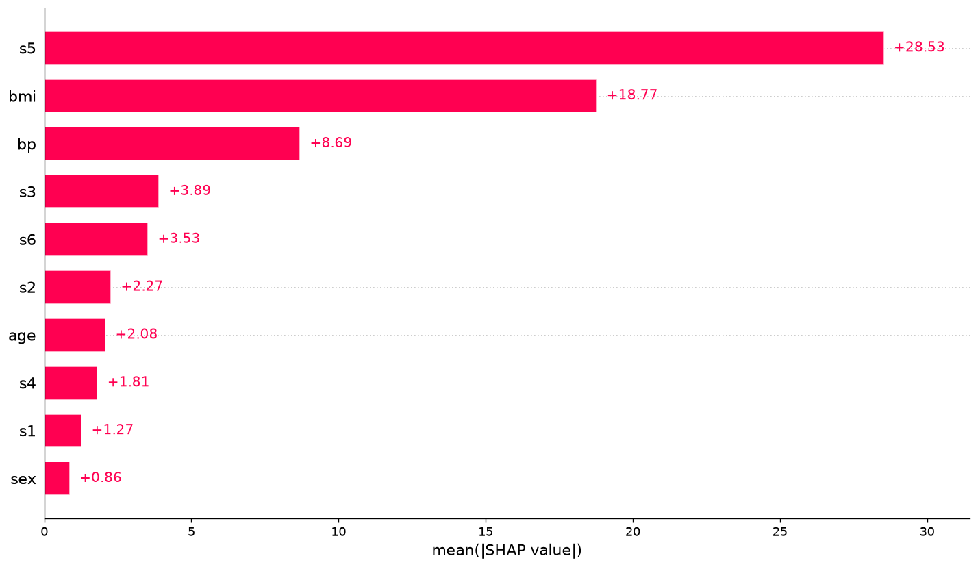
The ranking is an empirical summary for this model, split, and explanation subset. It does not say that changing s5 by one unit causes a target change of 28.53. The serum variables are correlated biological measurements, the feature encoding is standardized, and the forest may distribute related signal among splits. Replicating the analysis across resamples can show whether the ranking is stable.
Beeswarm distribution
A beeswarm plot retains information discarded by the bar chart. Every point represents one observation-feature attribution; horizontal position gives signed SHAP value, while color encodes the corresponding feature value. Dense bands reveal common effects, long tails reveal influential observations, and mixed colors at both signs can suggest nonlinearity, interactions, or correlation.
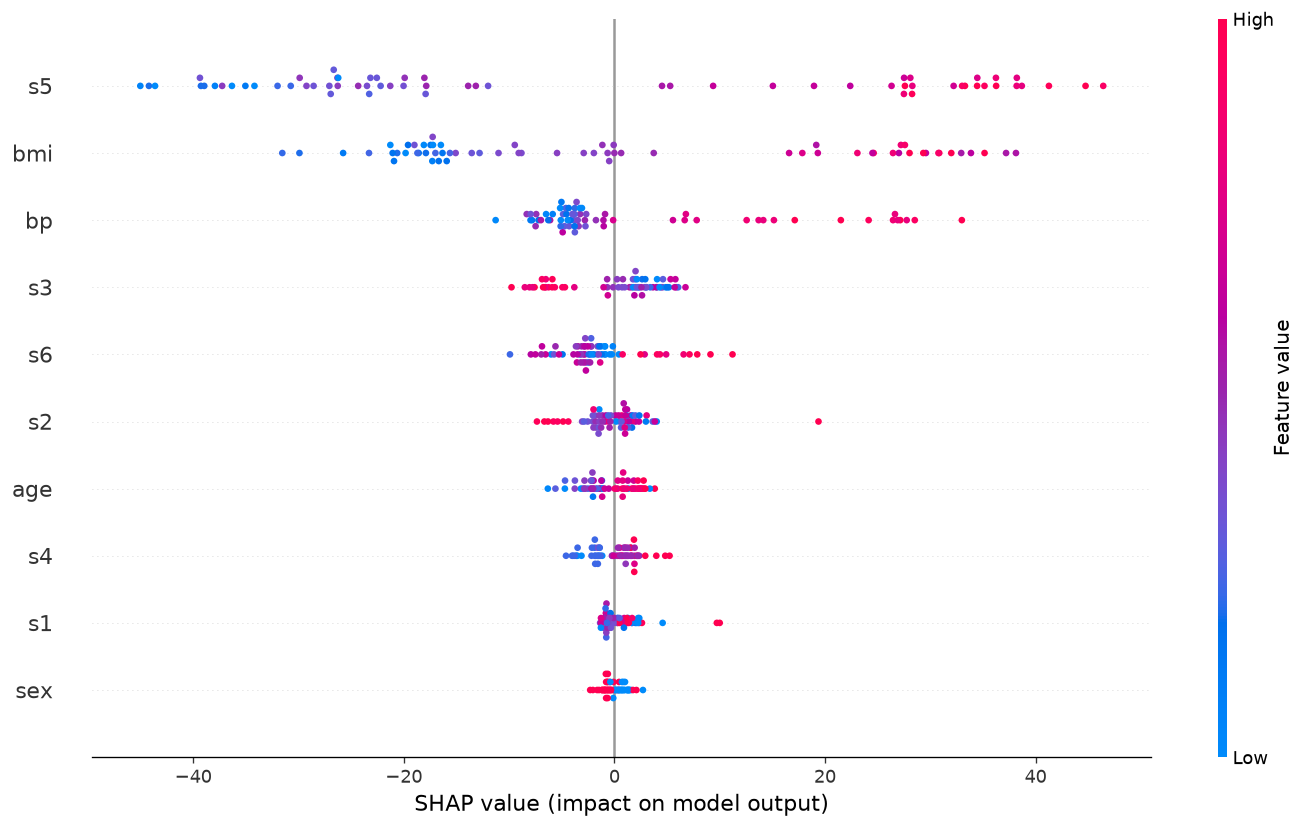
Color patterns should be read as properties of the fitted forest, not dose-response evidence. When red high values cluster on the positive side, the model tends to associate high feature values with increased predictions in this sample. Confounding, selection, measurement error, and correlated predictors can all create such a pattern without a causal relationship.
Dependence plot
The dependence plot places one feature’s observed value on the horizontal axis and its SHAP contribution on the vertical axis. It helps reveal thresholds, saturation, nonmonotonic behavior, and vertical spread that may reflect interactions. The retained workflow selected the globally leading feature from the computed table rather than hard-coding a scientifically convenient variable.
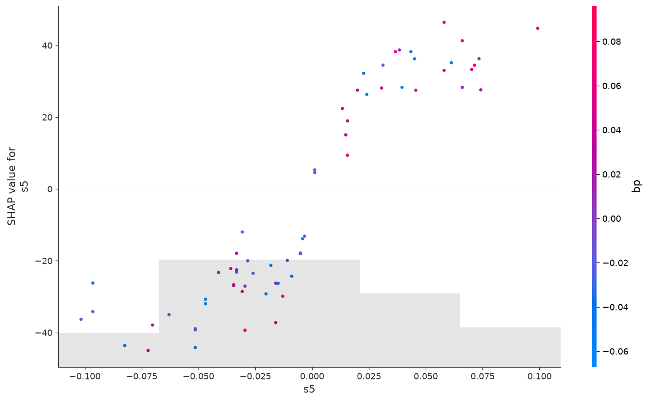
A dependence plot is not a partial-dependence estimate and not an intervention curve. The horizontal distribution reflects the available sample, and the vertical attribution depends on other measured predictors. Sparse regions should not support confident claims. For correlated clinical variables, accumulated local effects, conditional expectation methods, sensitivity analyses, and subject-matter review can complement this diagnostic.
Local waterfall explanation
Global summaries can obscure individual behavior. A waterfall plot starts at the expected model output and shows how each feature moves one selected prediction upward or downward until the final output is reached. It is valuable for auditing surprising predictions, checking feature mapping, and communicating the distinction between baseline and instance-specific contributions.
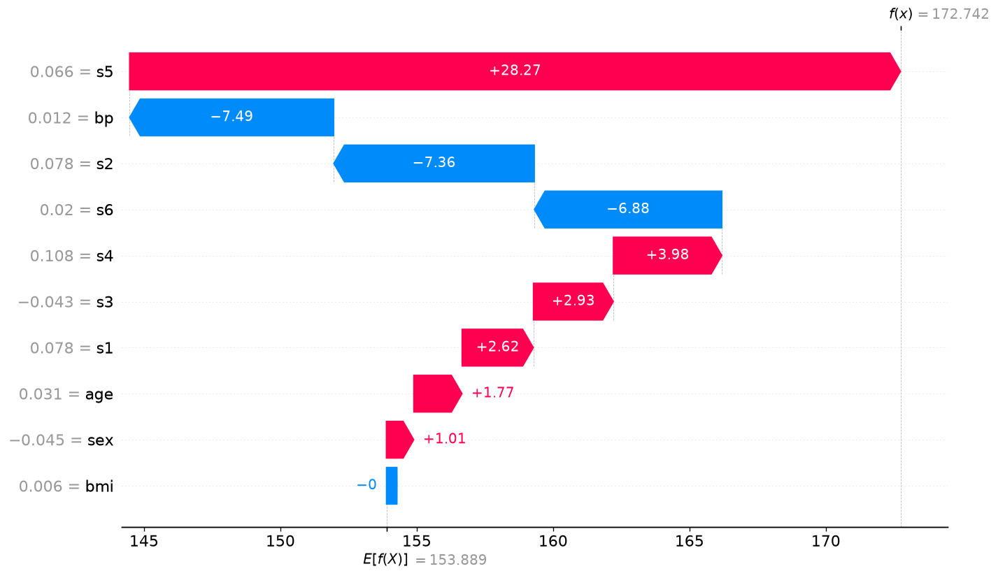
One local explanation is not representative of all observations. Choosing an especially dramatic case after inspecting results can create selection bias. A production report should define case-selection rules in advance, examine correct and incorrect predictions, review outliers, and avoid exposing sensitive row-level information.
Test progress
| Validation gate | Status | Retained evidence |
|---|---|---|
| Package installation | Passed | SHAP 0.52.0 in a retained Linux CPU environment |
| Native key-feature cycle | Passed | Forest fitting, TreeExplainer, metrics, additivity, CSV, JSON, and PNG |
| Real chat-directed execution | Passed | Attempt 5 created every exact deliverable |
| Dataset and split | Passed | 442×10; 331 training and 111 held-out rows |
| Explanation sample | Passed | 64 held-out observations |
| Additivity | Passed | Maximum error 1.9895196601282805e-13 |
| Figure contract | Passed | Four distinct scientific PNG artifacts |
| Focused application evidence | Passed | Playwright result-report screenshot |
Five retained attempts represent a real feedback cycle. Earlier attempts exposed output naming and schema ambiguities rather than being relabeled as success. The fifth attempt satisfied the exact artifact contract and semantic checks. Publication begins only from that passed report; missing values, invented figures, or a merely successful package import would not qualify.
Demo user request
Use the installed SHAP skill and retained Python environment to analyze
diabetes-explanation.json. Load the real scikit-learn diabetes teaching dataset, fit the declared RandomForestRegressor on the fixed split, and use realshap.TreeExplaineron the first 64 held-out rows. Validate SHAP additivity against model predictions, calculate held-out R² and MAE, rank global mean absolute SHAP values, and create global bar, beeswarm, dependence, and one-observation waterfall plots. Save the exact JSON, CSV, and PNG deliverables. Treat SHAP values as explanations of the fitted prediction function, not causal effects, biological mechanisms, or clinical evidence.
The natural-language request supplies goals, constraints, input, checks, and deliverables. The agent reads the skill and fixture, writes the analysis program, executes it in the managed environment, and inspects outputs. Users do not need to write Python. The command below is shown only to make the retained workflow auditable.
Demo data
The linked fixture diabetes-explanation.json contains the seed, dataset identifier, split fraction, model class and hyperparameters, explanation-row count, and interpretive scope. It contains no precomputed SHAP values or expected feature ranking. Those outputs must come from the real fitted model.
| Fixture field | Declared value | Purpose |
|---|---|---|
| Seed | 20260727 | Reproduce split and model randomness |
| Dataset | sklearn diabetes | Public teaching regression data |
| Test fraction | 0.25 | Preserve held-out evaluation |
| Trees / depth | 120 / 5 | Define the fitted forest |
| Explained rows | 64 | Bound and identify explanation sample |
~/.mindplot/envs/skill-shap/bin/python analyze_shap.py
The generated script loaded the fixture, trained the estimator, called shap.TreeExplainer, calculated predictions and SHAP arrays, verified reconstruction, and rendered publication-sized plots. The retained source and outputs make it possible to audit what the agent actually ran.
Results and artifacts
| Result | Exact observed value | Scientific reading |
|---|---|---|
| SHAP version | 0.52.0 | Versioned API boundary |
| Dataset shape | 442×10 | Full public teaching matrix |
| Training / held-out | 331 / 111 | Fixed 75/25 split |
| Explained observations | 64 | Subset used for attribution summaries |
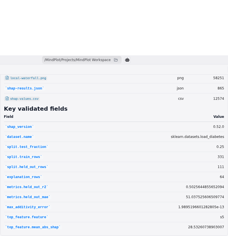
| Held-out R² | 0.5025644855652094 | Moderate predictive fit on this split |
| Held-out MAE | 51.037525606509774 | Average absolute error in target units |
| Top feature | s5 | Highest mean absolute attribution |
| Top mean absolute SHAP | 28.53260738903007 | Model-output units, not causal effect |
| Maximum additivity error | 1.9895196601282805e-13 | Numerical reconstruction passed |
shap-results.json records versions, dimensions, metrics, diagnostics, and scope. global-importance.csv makes the complete ranking inspectable. shap-values.csv retains one row per explained observation and one column per feature, plus source row index. The four PNG files present complementary global, distributional, dependence, and local views.
Additivity and numerical validation
For each explained row, the validator compared the forest prediction with the expected value plus the sum of SHAP contributions. The maximum absolute difference was roughly two ten-trillionths, consistent with floating-point rounding. This checks local accuracy and catches common implementation failures such as explaining the wrong rows, transposing the contribution matrix, dropping columns, or combining outputs from different estimators.
Additivity does not validate causal interpretation, data quality, generalization, or fairness. It only verifies that the explanation array reconstructs the represented model output. The workflow consequently checks shape, versions, split counts, metrics, CSV content, image dimensions, and scope in addition to the additivity threshold.
Responsible interpretation
SHAP explanations inherit every limitation of the underlying dataset and model. Missing variables can make observed predictors stand in for unmeasured factors. Correlation can make attribution unstable. Data leakage can produce convincing explanations of an invalid prediction pipeline. Selection bias can prevent transport to another population. Protected attributes may be encoded indirectly in other variables.
Before operational use, analysts should define the decision, harm model, evaluation population, acceptable errors, and review procedure. Compare explanations across resamples and model families. Inspect subgroup performance and attribution distributions. Test sensitivity to background data and dependence assumptions. Keep a human-readable model card that states intended use, prohibited use, training period, preprocessing, and monitoring boundaries.
Clinical interpretation demands substantially more evidence: prospective evaluation, representative cohorts, calibration, uncertainty, regulatory and ethical review, and proof that using the model improves outcomes. Nothing in this teaching run supplies those requirements. It is a reproducible demonstration of an explanation tool.
Reproducibility
Reproduction requires the fixture, source dataset version, train/test indices or deterministic seed, estimator parameters, library versions, explanation-row selection, feature ordering, explainer configuration, and artifact checksums. A screenshot alone is not reproducible evidence. The cycle preserves the generated program, JSON, both CSV tables, four figures, logs, and semantic report.
Package-version changes can alter tree behavior, plotting defaults, serialization, or numerical output. A future upgrade should rerun the entire functional and chat cycle instead of assuming compatibility from an import test. Linux x86_64 CPU is the validated platform for this attempt; macOS, Windows, ARM, CUDA, and other versions require their own evidence.
Limitations
The sample is small, uses one historical teaching dataset, one random split, one estimator family, and one fixed hyperparameter set. The explanation subset has only 64 rows. There is no repeated cross-validation, external cohort, temporal validation, missing-data stress test, subgroup audit, hyperparameter selection analysis, uncertainty interval, or comparison with alternative explainers.
The short feature names s1 through s6 are intentionally de-identified and should not be assigned biological meanings by guesswork. Mean absolute attribution loses direction. Dependence color and shape can reflect interaction or correlation. The waterfall plot represents one chosen row. R² and MAE do not establish clinical utility. The results explain model predictions, not disease mechanisms, interventions, or individual prognosis.
References
- Lundberg and Lee, A Unified Approach to Interpreting Model Predictions
- Lundberg et al., From local explanations to global understanding with explainable AI for trees
- SHAP TreeExplainer documentation
- scikit-learn diabetes dataset documentation
- Interpretable Machine Learning: SHAP chapter
Try this workflow
MindPlot includes built-in support for this scientific workflow. Attach a tabular dataset or describe a fitted-model explanation task in ordinary language; the agent can write and run the analysis, retain numerical tables and figures, validate deliverables, and explain responsible-use boundaries. Try it online at mindplot.ai or download the desktop version for stronger local-data privacy.